| QuesoGLC |
| Documentation |
| Sourceforge |
|
|

|
Glyph ConventionsPreambleThis document discusses in great details the definition of various concepts related to digital typography, as well as the core conventions used within QuesoGLC library to manage font and glyph data. It also explains the ways typographic information, like glyph metrics, kerning distances, etc.. is to be managed and used. It relates to the layout and display of text strings, either in a conventional (i.e. Roman) layout, or with right-to-left or vertical ones. Some aspects like rotation and transformation are explained too.It is a must-read for all developers who need to understand digital typography, especially if you want to use the QuesoGLC library in your projects. This document is largely inspired of the FreeType documentation which has been slightly modified in order to give valuable informations to QuesoGLC users. For instance, parts dealing with outline and bitmap management has been removed since this does not concern the GLC library. The original document FreeType Glyph Conventions is copyright 1998-2000 David Turner and copyright 2000 The FreeType Development Team. Basic Typographic ConceptsFont files, format and informationA font is a collection of various character images that can be used to display or print text. The images in a single font share some common properties, including look, style, serifs, etc. Typographically speaking, one has to distinguish between a font family and its multiple font faces, which usually differ in style though come from the same template.For example, "Palatino Regular" and "Palatino Italic" are two distinct faces from the same famous family, called "Palatino" itself.
The single term font is nearly always used in ambiguous ways to refer to either a given family or given face, depending on the context. For example, most users of word-processors use "font" to describe a font family (e.g. "Courier", "Palatino", etc.); however most of these families are implemented through several data files depending on the file format: for TrueType, this is usually one per face (i.e. A digital font is thus a data file that may contain one or more font faces. For each of these, it contains character images, character metrics, as well as other kind of information important to the layout of text and the processing of specific character encodings. In some awkward formats, like Adobe's Type 1, a single font face is described through several files (i.e. one contains the character images, another one the character metrics). We will ignore this implementation issue in most parts of this document and consider digital fonts as single files, though QuesoGLC is able to support multiple-files fonts correctly. As a convenience, a font file containing more than one face is called a font collection. This case is rather rare but can be seen in many Asian fonts, which contain images for two or more representation forms of a given scripts (usually for horizontal and vertical layout). Character images and mappingsThe character images are called glyphs. A single character can have several distinct images, i.e. several glyphs, depending on script, usage or context. Several characters can also take a single glyph (good examples are Roman ligatures like "fi" and "fl" which can be represented by a single glyph). The relationships between characters and glyphs can be very complex, but won't be discussed in this document. Moreover, some formats use more or less awkward schemes to store and access glyphs. For the sake of clarity, we only retain the following notions when working with QuesoGLC :
Character and font metricsEach glyph image is associated with various metrics which are used to describe how must be placed and managed when rendering text. These are described in more details in Glyph metrics, they relate to glyph placement, cursor advances as well as text layout. They are extremely important to compute the flow of text when rendering a string of text.Each scalable format also contains some global metrics, expressed in notional units, to describe some properties of all glyphs in the same face. Examples for global metrics are the maximum glyph bounding box, the ascender, descender and text height for the font. Though these metrics also exist for non-scalable formats, they only apply for a set of given character dimensions and resolutions, and are usually expressed in pixels then. Glyph outlinesThis section describes the way scalable representations of glyph images, called outlines, are used by QuesoGLC as well as client applications.Pixels, points and device resolutionsThough it is a very common assumption when dealing with computer graphics programs, the physical dimensions of a given pixel (be it for screens or printers) are not squared. Often, the output device, be it a screen or printer, exhibits varying resolutions in both horizontal and vertical direction, and this must be taken care of when rendering text.It is thus common to define a device's characteristics through two numbers expressed in dpi (dots per inch). For example, a printer with a resolution of 300x600 dpi has 300 pixels per inch in the horizontal direction, and 600 in the vertical one. The resolution of a typical computer monitor varies with its size (15" and 17" monitors don't have the same pixel sizes at 640x480), and of course the graphics mode resolution. As a consequence, the size of text is usually given in points, rather than device-specific pixels. Points are a simple physical unit, where 1 point = 1/72th of an inch, in digital typography. As an example, most Roman books are printed with a body text whose size is somewhere between 10 and 14 points. It is thus possible to compute the size of text in pixels from the size in points with the following formula:
pixel_size = point_size * resolution / 72The resolution is expressed in dpi. Since horizontal and vertical resolutions may differ, a single point size usually defines a different text width and height in pixels. Unlike what is often thought, the "size of text in pixels" is not directly related to the real dimensions of characters when they are displayed or printed. The relationship between these two concepts is a bit more complex and relate to some design choices made by the font designer. This is described in more detail in the next sub-section (see the explanations on the EM square). Vectorial representationThe source format of outlines is a collection of closed paths called contours. Each contour delimits an outer or inner region of the glyph, and can be made of either line segments or Bézier arcs.The arcs are defined through control points, and can be either second-order (these are conic Béziers) or third-order (cubic Béziers) polynomials, depending on the font format. Note that conic Béziers are usually called quadratic Béziers in the literature. Hence, each point of the outline has an associated flag indicating its type (normal or control point). And scaling the points will scale the whole outline. Each glyph's original outline points are located on a grid of indivisible units. The points are usually stored in a font file as 16-bit integer grid coordinates, with the grid origin's being at (0,0); they thus range from -16384 to 16383. (Even though point coordinates can be floats in other formats such as Type 1, we will restrict our analysis to integer values for simplicity). The grid is always oriented like the traditional mathematical two-dimensional plane, i.e., the X axis from the left to the right, and the Y axis from bottom to top. In creating the glyph outlines, a type designer uses an imaginary square called the EM square. Typically, the EM square can be thought of as a tablet on which the characters are drawn. The square's size, i.e., the number of grid units on its sides, is very important for two reasons:
pixel_size = point_size * resolution / 72pixel_coord = grid_coord * pixel_size / EM_size
Note that glyphs can freely extend beyond the EM square if the font designer wants so. The EM is used as a convenience, and is a valuable convenience from traditional typography. Grid units are very often called font units or EM units.
As said before,

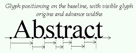
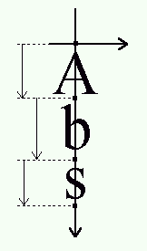
As one can see, the glyphs of the Courier family are smaller than those of Times New Roman, which themselves are slightly smaller than those of Arial, even though everything is displayed or printed at a size of 16 points. This only reflects design choices. Hinting and Bitmap renderingThe outline as stored in a font file is called the "master" outline, as its points coordinates are expressed in font units. Before it can be converted into a bitmap, it must be scaled to a given size/resolution. This is done through a very simple transformation, but always creates undesirable artifacts, e.g. stems of different widths or heights in letters like "E" or "H".As a consequence, proper glyph rendering needs the scaled points to be aligned along the target device pixel grid, through an operation called grid-fitting (often called hinting). One of its main purposes is to ensure that important widths and heights are respected throughout the whole font (for example, it is very often desirable that the "I" and the "T" have their central vertical line of the same pixel width), as well as to manage features like stems and overshoots, which can cause problems at small pixel sizes. Glyph metricsBaseline, pens and layoutsThe baseline is an imaginary line that is used to "guide" glyphs when rendering text. It can be horizontal (e.g. Roman, Cyrillic, Arabic, etc.) or vertical (e.g. Chinese, Japanese, Korean, etc). Moreover, to render text, a virtual point, located on the baseline, called the pen position or origin, is used to locate glyphs.Each layout uses a different convention for glyph placement:
Typographic metrics and bounding boxesA various number of face metrics are defined for all glyphs in a given font.
Other, simpler metrics are:
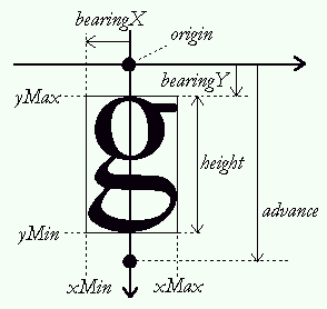
Bearings and advancesEach glyph has also distances called bearings and advances. Their definition is constant, but their values depend on the layout, as the same glyph can be used to render text either horizontally or vertically:
Here is a picture giving all the details for horizontal metrics:
And here is another one for the vertical metrics:
The effects of grid-fittingBecause hinting aligns the glyph's control points to the pixel grid, this process slightly modifies the dimensions of character images in ways that differ from simple scaling.For example, the image of the lowercase "m" letter sometimes fits a square in the master grid. However, to make it readable at small pixel sizes, hinting tends to enlarge its scaled outline in order to keep its three legs distinctly visible, resulting in a larger character bitmap. The glyph metrics are also influenced by the grid-fitting process:
This has some implications:
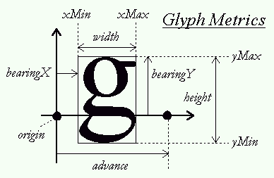
Performing 2D transformations on glyph outlines is very easy with FreeType. However, when using translation on a hinted outlines, one should aways take care of exclusively using integer pixel distances. Otherwise, the translation will simply ruin the hinter's work, resulting in a very low quality bitmaps! Text widths and bounding boxAs seen before, the "origin" of a given glyph corresponds to the position of the pen on the baseline. It is not necessarily located on one of the glyph's bounding box corners, unlike many typical bitmapped font formats. In some cases, the origin can be out of the bounding box, in others, it can be within it, depending on the shape of the given glyph.Likewise, the glyph's "advance width" is the increment to apply to the pen position during layout, and is not related to the glyph's "width", which really is the glyph's bounding width. The same conventions apply to strings of text. This means that:
|
|
|

|
Generated on Sun Sep 3 21:06:34 2006 for QuesoGLC by
 1.4.4 written by Dimitri van Heesch © 1997-2005